Look at a Painting Through Three Color Questions
Move beyond naming colors. Compare lightness, intensity and the way one patch changes beside another.
Calling a painting 'blue' is a starting point, not a complete description. The same broad color family can appear pale, dark, vivid or muted. Looking for those differences gives you a more precise way to explain what you see.
Name, lightness and intensity
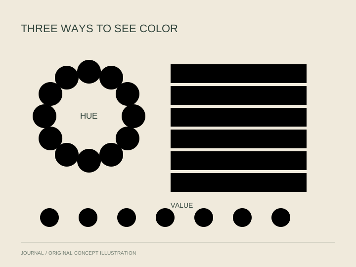
Art education commonly distinguishes hue, value and intensity. Hue names a color family. Value concerns how light or dark it appears. Intensity concerns its brightness or dullness. These qualities can vary independently, so a dark blue need not be the most intense blue in a picture.
Choose three small areas in a painting. Describe each with those three questions, using your own words rather than trying to produce a technical measurement. Notice whether your first description becomes more specific.
Look at the neighbor
Next, compare each area with the color beside it. Does a pale patch seem more noticeable against a dark surrounding area? Does a muted passage give a stronger accent room to stand out? Treat these as observations about the particular work, rather than universal rules about emotion.
Return to the whole
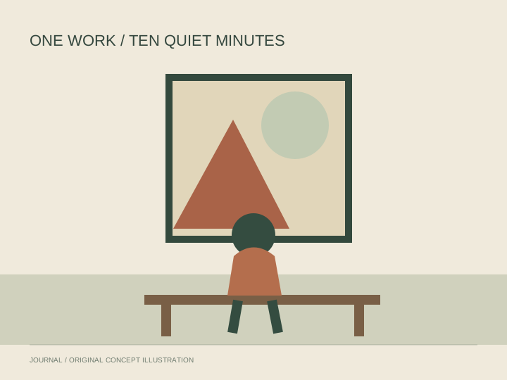
Step back and ask where your attention goes first. Compare that answer with your close-up notes. A small area may dominate a composition because of contrast, while a large field may provide a quieter setting.
End with one sentence that connects a color decision to something visible: 'The light patch draws my eye toward the figure.' That is more informative than deciding that a color always carries one fixed meaning.