Read a Painting in Light and Dark Before Naming Its Colors
Set color names aside for a moment and describe where the strongest light-dark relationships occur.
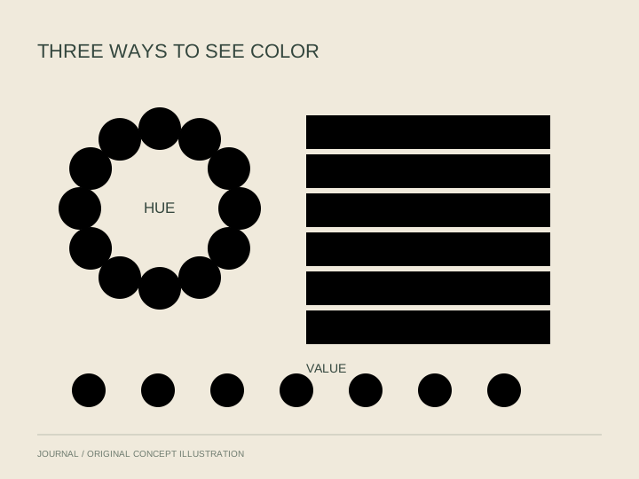
Color names are useful, but they can dominate a conversation about a painting. Calling an area blue or red does not tell us how light or dark it appears beside its neighbors. A brief value exercise makes room for that second relationship.
Choose broad groups
Value describes relative lightness and darkness. Look for a few broad groups rather than trying to assign a number to every patch. Which area seems lightest, which seems darkest, and what lies between them?
You do not need a filter or a converted black-and-white image to begin. Simply compare neighboring areas and allow uncertainty in your description. If you use a digital reproduction, remember that screen settings and the reproduction itself affect what you see.
Make a three-sentence map
Write one sentence about the largest light area, one about the largest dark area and one about the boundary between them. Avoid interpreting the subject for these three sentences. Describe where the areas are and how they meet.
Next ask where the strongest contrast occurs. Is it attached to the subject you first noticed, or somewhere less obvious? If the answer surprises you, look again before explaining it. A useful note can be provisional rather than polished.
Bring the color names back
Now add the hue names you initially set aside. Do two differently colored areas seem similar in lightness? Does one color appear in both light and dark passages? These questions help you keep hue and value distinct without treating them as unrelated experiences.
Finish by comparing your value map with the picture's overall mood. Phrase that connection as a response you can support with visible details. Dark does not always mean sad, and light does not always mean cheerful.
The exercise is a tool for describing relationships, not a replacement for seeing the work in person or a way to recover an artwork's original colors from a screen. It gives the next look a clear purpose while leaving room for the picture to resist your first account.